Over the past year, we've been working away behind the scenes on revamping our brand. We'd started to notice the occasional comment creeping in from customers about our image not doing justice to the quality of our product.
Now we're excited to introduce you to the new (but familiar) Slidebank. We're not changing who we are, we're just letting our brand catch up with our technology.
Here's how we got here....
What needed to change
Slidebank has been around for a little while. As one of the first presentation management systems on the market, we've had both the advantage of being an early pioneer, learning first hand from the needs of our customers, and the disadvantage of everything starting to look a little, well, familiar, over time. As our product has matured, so has our brand identity, although perhaps not for the better.
Some of the comments we were receiving in feedback were that our brand was "old fashioned" and "out of date", and even that "the visual impression of our interface didn't match the sophistication of our technology". Ouch! Whilst we had been busy focussing on building the most robust, intuitive, and efficient platform that we could, and providing top-notch support to our customers, we had perhaps neglected the aesthetic side of things a little. We'll take that on the chin!

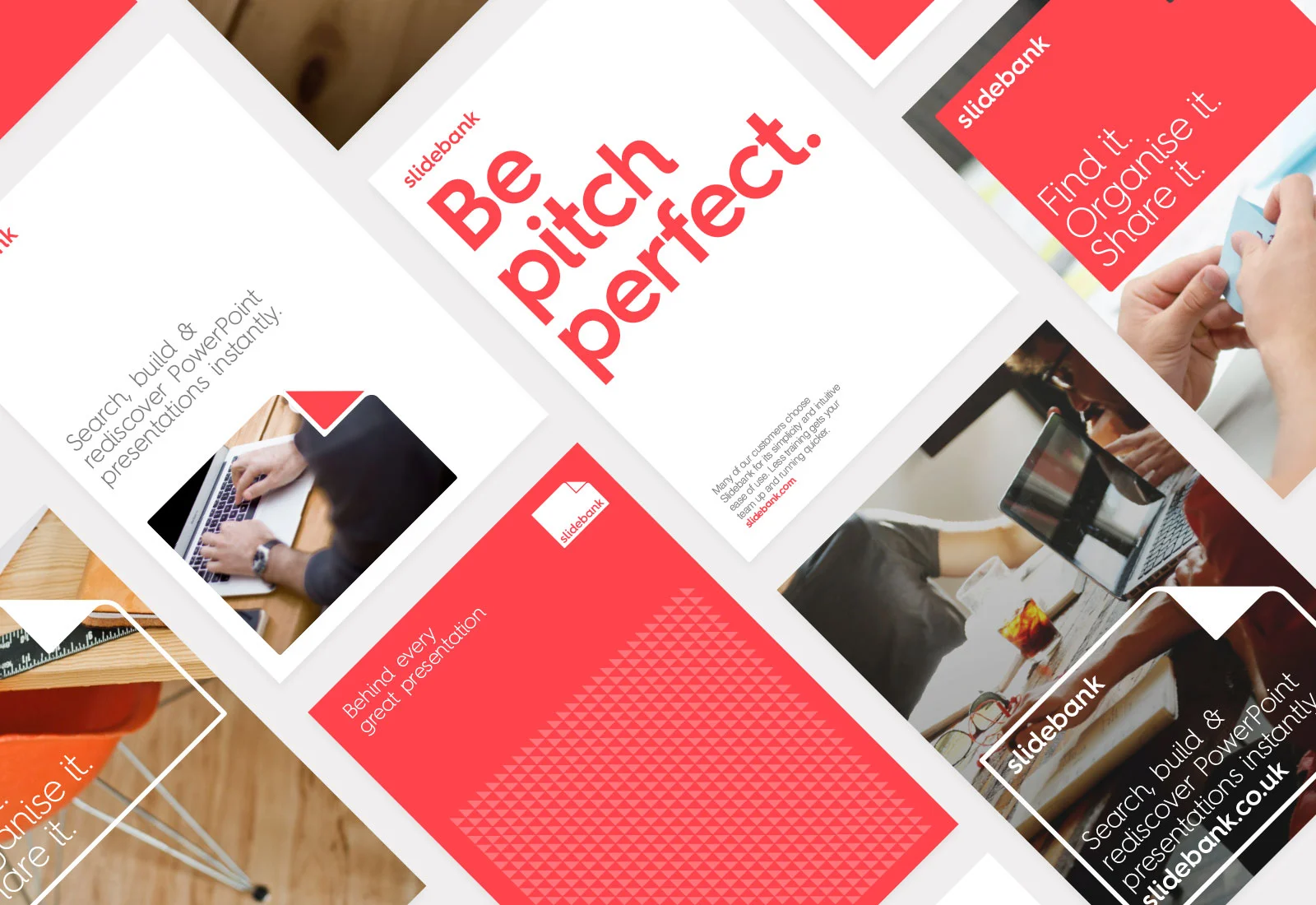
The original Slidebank interface had started to look a little tired
As a result, this process has not been one of reinventing ourselves. We're pretty happy with who we are and how we do business. We'll freely admit that our priorities are on building the best product we can and helping our users, rather than the flashier aspects of brand-building. That's made this rebrand a case of bringing who we already are to the fore and making that shine across our brand's touch points, including our interface. We really like what we've come up with, and hope you do too!
So... who are we then?
If not some flashy, loud, in-your-face, glittery, attention-grabbing brand?
At first, this was a difficult question to answer. Not easily given to navel-gazing, this part of the process felt a little alien. We went around the houses a bit, and some thoughts definitely hit the cutting room floor pretty quickly. However, in and amongst the curveballs, a few hallmark characteristics kept cropping up that we just couldn't ignore.
Firstly, we really care about our customers, probably even more than we should. It would be easy for us to get a lot more users through the door and let them try out our software without any help. However, we like to build a relationship with all our customers, guide them through demos one-to-one, be on hand when they need help, and even help them to train their users. We want you to get to know and love our product like we do, so helping you is really important to us, even if it means we end up with fewer customers overall. Quality is what matters.
Secondly, your security and privacy are top of our agenda. A huge proportion of our development time and attention is spent on making sure we're employing the best possible practices and systems for hosting your data securely. This could not be more important to us, our sense of integrity and satisfaction. We're kinda nerds for this level of robustness and getting the right frameworks in place. "Big things first" is our mantra, and if more of our focus is given to that than to Twitter, it's something we're OK with!

We love a little pun here and there!
We're friendly and straightforward (we think! If not, please tell us otherwise!). Whilst our priorities are pretty serious (see above), we're not averse to a little irreverent humour. We love the odd pun, and too many bad 'Dad jokes' probably make it into our emails without us even noticing. Sorry in advance... this kind of thing's in our DNA and we probably couldn't help it if we tried. Anyway, you can't be too serious all the time!
It's actually all about you... from the way we've designed our interface, to the way we run our operations, it's all geared to helping you manage your PowerPoint content in the most powerful way possible. We're very happy to take a back seat and let your content shine. We'll even let you replace our logo with yours if it's important to you. We're not precious like that - if it helps, it helps!
How do we inject this lovely stuff into our brand?
We know that a brand isn't just what you look like, it's what you do as well .... but how were we to inject a little of who we already are into a visual identity that was just a bit impenetrable? Fortunately, we had a little help from our friends at Confederation Studio. They've expertly helped us navigate this rebrand, playing a role somewhere in between brand creatives and guidance councillors!
Here's how, between us, we did it...
Our brand promise
Our raison d'etre. Why we're here, why we get out of bed in the morning, and why should you care about us.... that reason is to help you build and deliver great presentations. Consistently, accurately, compliantly (is that a word?) in every pocket of your organization, every time. Simple. If they're not great presentations (for all concerned - sales, marketing, legal, finance...), why bother?
We like to think of ourselves as the silent, secret support that lets you do this. Your content - sharing it, protecting it, updating it - is by far and away the most important component in this process. It's your content that needs to shine. We're just the platform in the background, bringing it all together.
We are, very simply, behind every great presentation.

We're the quiet support that helps you build great presentations, every time
Turning the corner on our visual identity
What's more evocative than the turning of a new page, loaded with the promise of great content?
When using Slidebank, we want you to be excited by the wealth of possibilities at your fingertips. Instantly discoverable, your company's slide library can become a goldmine of insight with which to enthral your clients.
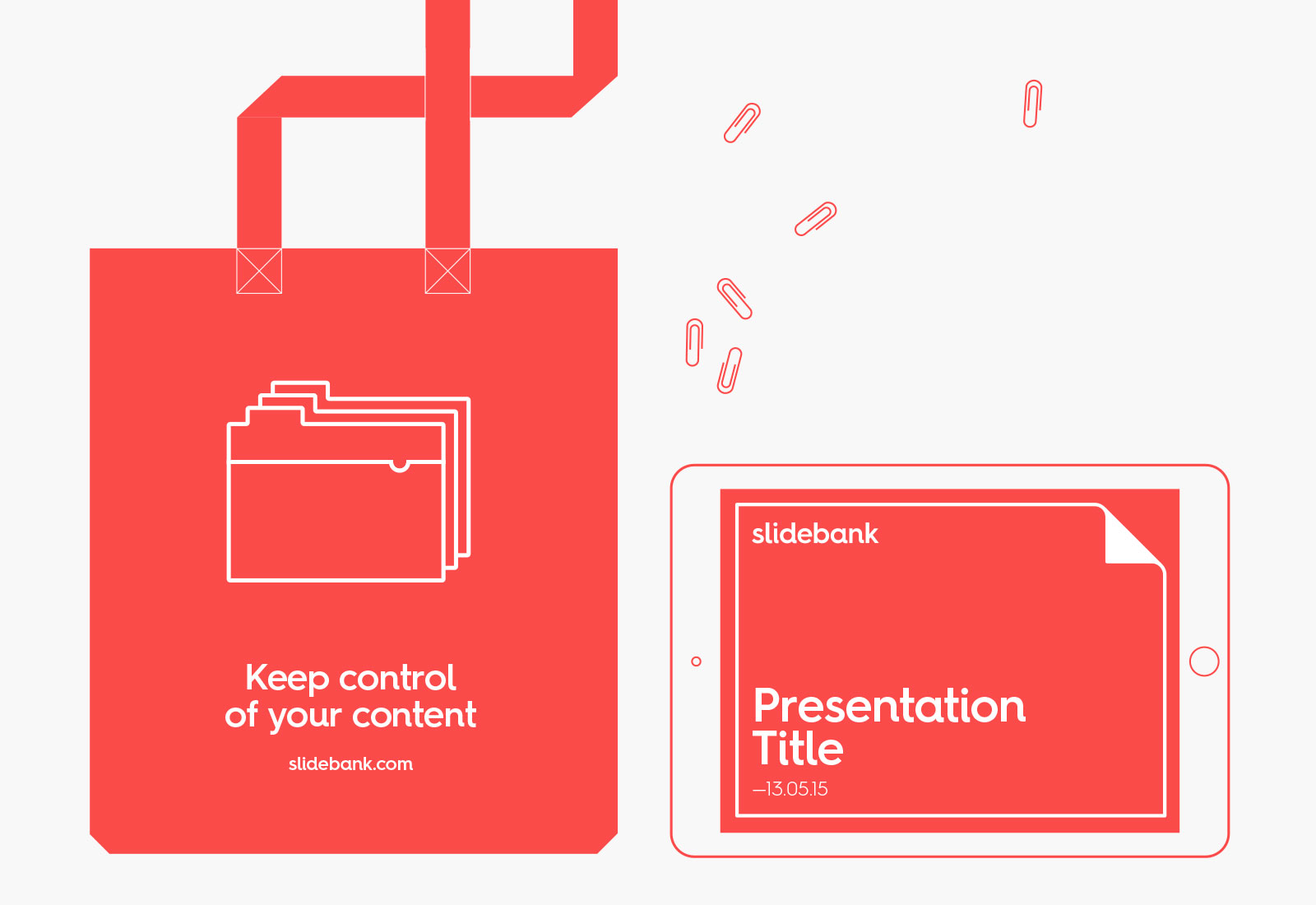
The promise of peeking behind the cover to glimpse a great presentation has become our emblem. Simple, elegant, refined and promising. It sums up what we're about pretty nicely.


There's red, and there's red...
Our brand colour has always been red. We wanted to keep this consistent, but to inject a little more warmth and friendliness into our brand.
We won't tell you just how many shades of red we stared at for months (trust us, it was a LOT!). The colour we settled on is confident and commanding, but playful, warm and engaging. Just how you'd want to feel when delivering your best ever presentation.

Our friendly new colour palette
Imagery and icons
Because we're all about putting your content first, we wanted imagery to take a back seat in our brand identity. You may see the odd image cropping up here and there, but our brand is really stripped back to its core essentials of vibrant, confident colour and a simple iconic device.
To add a little texture, however, we also have a cheeky series of trademark icons to bring to life some of our key features and selling points - such as the ability to deploy Slidebank quickly, to save time and money, and to communicate more clearly across your company.


Slidebank Interface
Most important of all, of course, is our platform. This is our biggest brand touch point, and the vehicle through which we deliver on our promise.
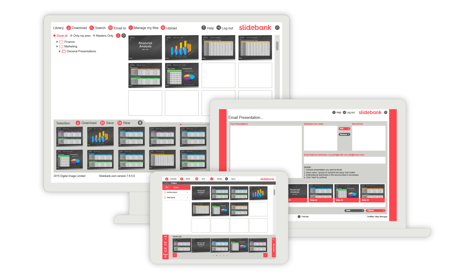
To bring our interface in line with our new brand, we've given it a makeover. Nothing truly drastic - you'll still find things in the same places - but it's simpler, cleaner and more dynamic.
We've also added some new functionality and feature enhancements, such as the ability to handle other Microsoft Office documents. You can read more about that here.
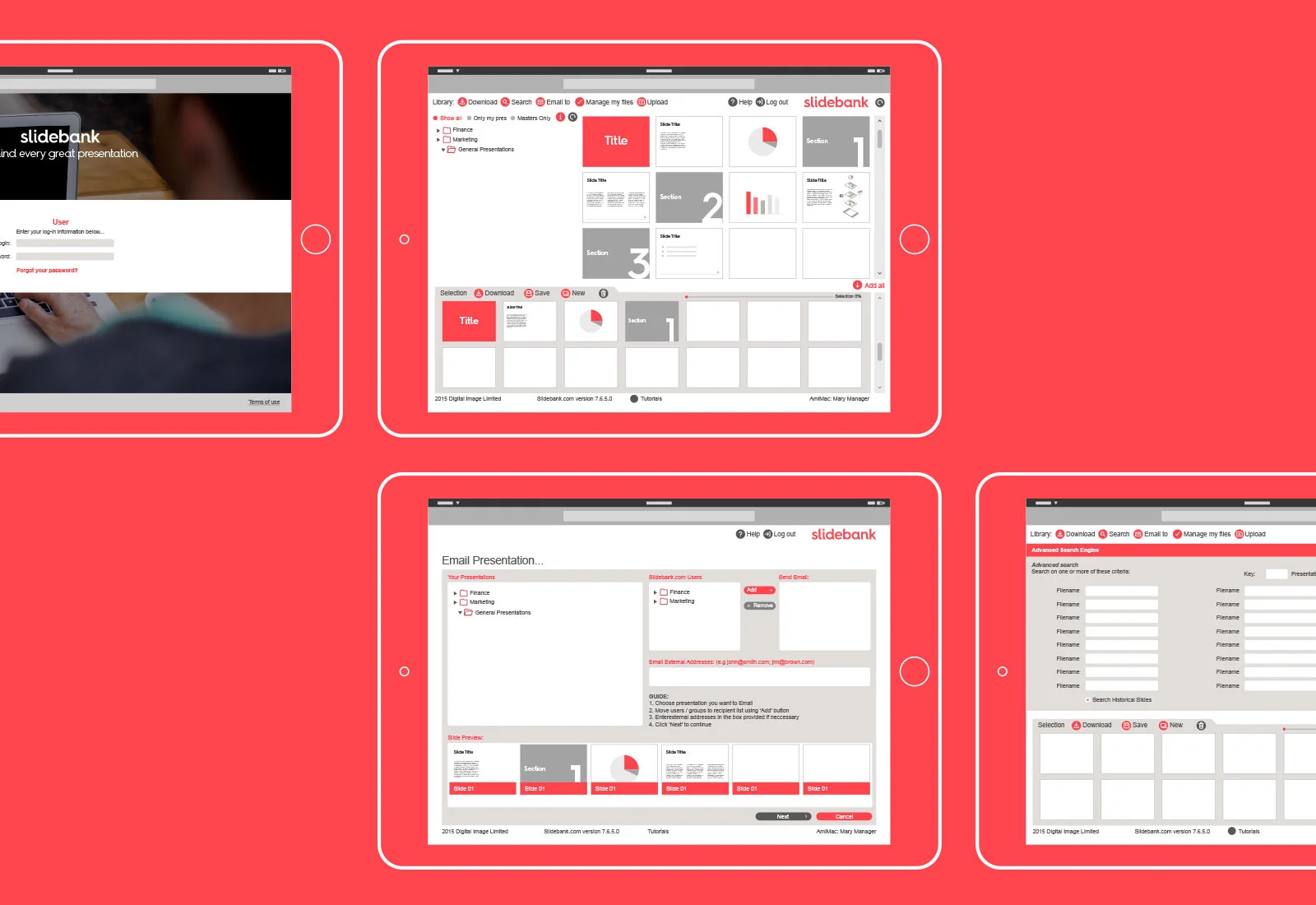
We've stripped the interface back to make it cleaner and help your content shine
The Slidebank experience is now cleaner, fresher and more responsive
We hope you like the changes that are a part of our ongoing evolution. Slidebank continues to grow and change, and we have big plans for the future. Now is a great time to get on board and help shape where we take the product next. We're always keen to hear feedback and feature requests so please get in touch.
As part of all this activity, you may even see us popping up on the likes of Twitter more often. If we go a little quiet, we are still here. We're probably just tinkering under the hood or cooking up new features. Go ahead and give us a poke... we need to get out more!!